Skip to content
Back to home

Case 02 · Localization, Below the Surface

Localization Below the Surface — Designing for Trust, Tone, and Context in Japan’s Medical Market

Localization is not translation: bringing medical SaaS into the Japanese market

Overview

  • While introducing medical SaaS into Japan, I found that the real driver of product trust was not translation completeness, but subtler cultural standards: professional tone, Japanese glyphs, brand approachability, CRM channels, and field research methods
  • I turned these observations into design decisions: AI Agent tone rules, Japanese font guidelines, website character direction and short video content, CRM communication across print / email / fax, and interview methods better suited to Japanese clinics
  • This case shows how I identified design risks behind cultural differences in cross-market product development, then translated them into product rules, communication materials, and team practices
Role
Initiated competitive analysis of Japanese booking systems and led multiple localization design decisions across Japan-market product development: AI Agent conversation tone, Japanese typography, website character direction, AI Widget style editor, and research-method adjustments after field interviews
Team
Collaborated with product, engineering, Japan sales, translators, and leadership; Japanese clinics and sales teams provided frontline market feedback
Timeline
2024/12 Japanese booking-system competitive research → 2025 PinMed Suite / 1.Talk Japan launch and timezone / typography rules → 2026 AI Agent, website AI Widget, CRM, and website communication materials
Outcome
Turned scattered cultural observations into product and design rules, making Japanese products more credible, AI conversations more appropriate for medical contexts, websites and CRM closer to Japanese clinics’ receiving contexts, and giving the team clearer design standards for future Japan-market work

0OpeningTranslation is only the surface layer of localization

When a product enters the Japanese market, translation is the first visible task: replacing Chinese with Japanese and moving existing workflows into Japan.

But through actual development, interviews, and market rollout, I quickly found that what truly affected product trust was often not translation completeness, but subtler cultural standards: whether an AI reply can use emoji, whether a kanji character looks Japanese, how an overseas medical SaaS brand can reduce unfamiliarity, whether CRM can rely only on online channels, and whether we really understood clinics during cross-language interviews.

These issues appeared across PinMed Suite, 1.Talk, AI Agent, website AI Widget, CRM, websites, and field research. But together, they pointed to the same thing: localization is not translating a product into another language; it is relearning how a local market understands professionalism, trust, and communication.

This case is not about a single feature. It is about how I identified design risks behind cultural differences while developing medical products for Japan, then translated them into product rules and executable team methods.

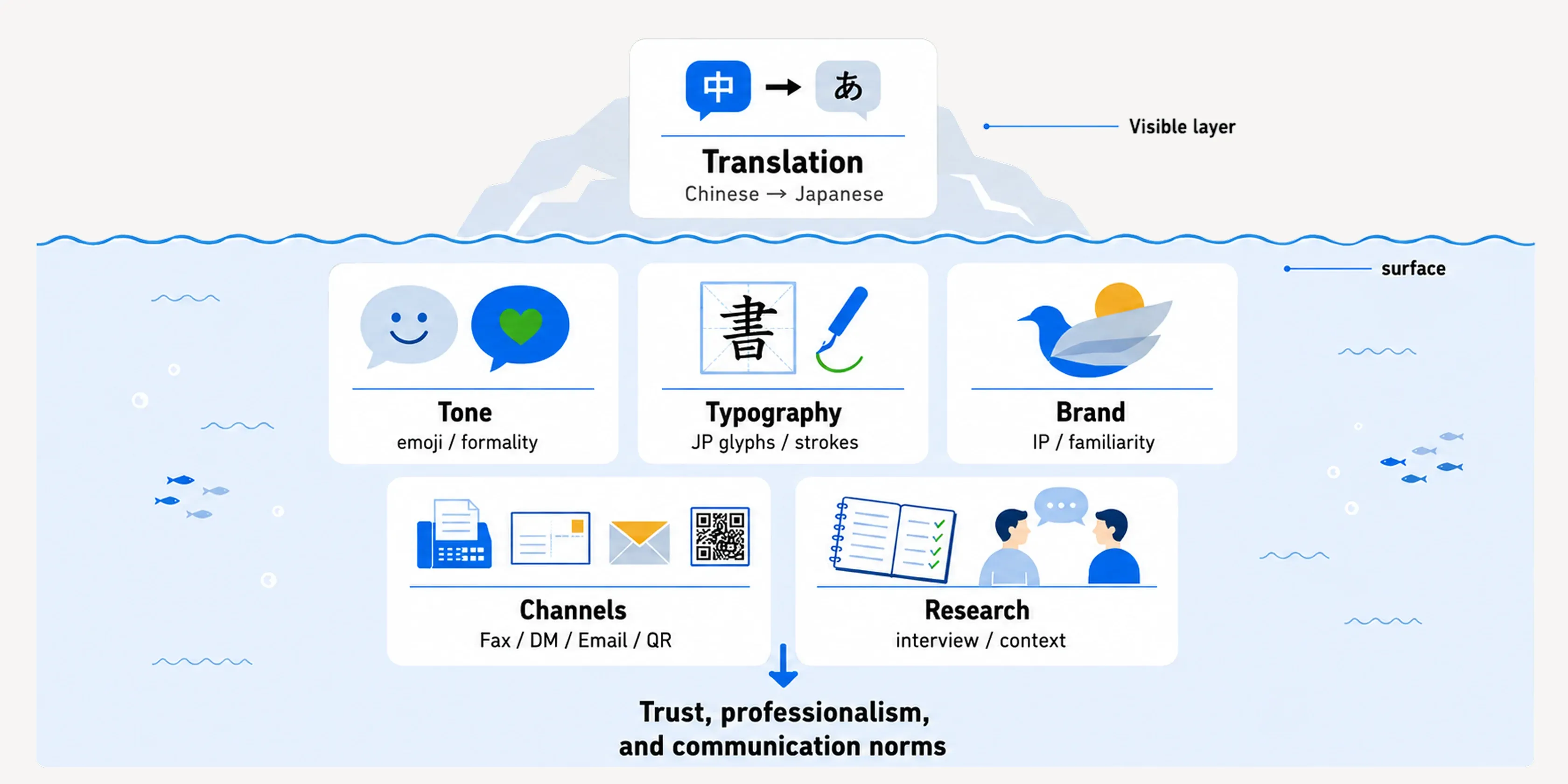
Layers of localization: translation at the surface; tone, glyphs, brand approachability, channels and research context underneath
Translation is only the surface layer of entering the Japanese market. What truly affects trust is tone, typography, brand approachability, channels, and research context.

Ch.1ToneAI cannot only be friendly; it has to be as trustworthy as a clinic

Problem: A tone that feels friendly in Taiwan can feel insufficiently rigorous in Japanese healthcare

In designing 1.Talk AI Agent, I had worked on “reply style settings,” allowing clinics to choose the assistant’s tone and make AI closer to the service style they wanted to present.

But when this AI conversation capability entered Japanese healthcare, I realized “reply style” could not only mean friendliness or brand personality. It had to return to how clinics are trusted within the local culture. This led to a small but critical question: should AI use emoji?

From a general chat-product perspective, emoji can make replies feel lighter, friendlier, and more human. But in Japanese medical clinics, AI Agent is not a casual brand chatbot or social media voice. It represents the clinic, replying to patients asking about treatments, appointments, fees, or post-treatment care.

In this role, an overly casual tone can weaken professionalism. Especially when a clinic needs to communicate caution, credibility, and formality, emoji may make the conversation look less rigorous, or even make users question whether this AI can really represent the clinic.

For more on how AI Agent reply style, settings flow, and clinic-controlled AI behavior were designed, see Case 1 · 1.Talk AI Agent.

My judgment: Redefine emoji from tone decoration into a clinic-controlled trust setting

This discovery also made me revisit my original thinking around AI Agent reply settings. In Taiwan, using emoji in customer support or brand communication is common; it softens tone and makes conversations feel more human. But in Japanese work culture, especially customer communication, emoji can be seen as insufficiently rigorous. In healthcare, this feeling is amplified because AI replies do not represent casual chat; they represent the clinic speaking to patients.

So I did not treat emoji as a secondary effect inside one reply style. I intentionally separated it into an independent switch, allowing clinics to decide whether to use it. I also kept multiple tone options, such as warm and gentle, professional and concise, and casual and natural, so clinics could choose according to brand personality, specialty, and patient relationship.

This was not simply adding one setting. It was translating cross-cultural difference into product control:

  • In Taiwan, emoji can signal warmth and approachability.
  • In Japanese healthcare, emoji can weaken rigor and professionalism.
  • Therefore, tone and emoji should not be hardcoded into AI behavior; they should become settings clinics can control.

This made me realize: localizing conversational UX is not translating prompts. It is turning different cultural interpretations of “friendly” and “professional” into selectable, controllable product rules.

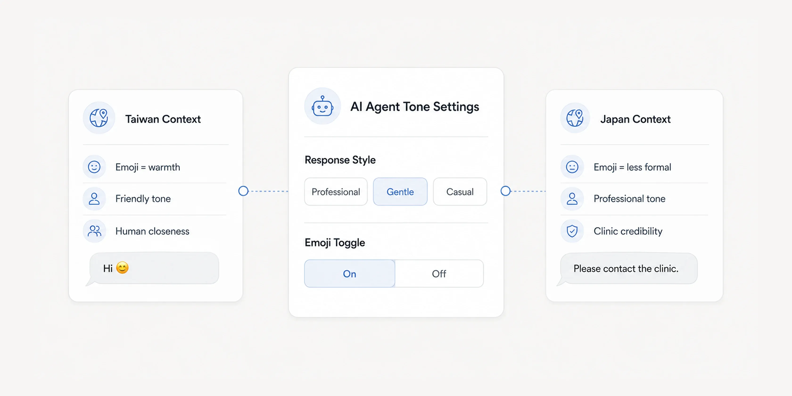
AI Agent reply style and emoji separated into configurable settings clinics control
Because Taiwan and Japan perceive emoji differently, I separated AI Agent reply style and emoji into configurable settings, allowing clinics to control tone according to brand and medical context.

Ch.2TypographyThe same kanji does not always create the same trust

Problem: It was not just a font-style difference; we initially did not realize Japanese kanji itself differs

Early in the Japan product launch, we did not immediately notice the difference between Japanese kanji and Chinese characters. Because Japanese and Chinese both use kanji / Han characters, some characters look very similar. At first, we easily interpreted visual awkwardness as a matter of font style, rather than realizing that Japanese kanji has systematic differences in strokes, structure, and writing conventions.

This issue was later pointed out by Japanese colleagues after launch. When they saw certain kanji in the interface, it did not feel like the Japanese characters familiar in Japanese culture; it felt more like a foreign product using the wrong language-specific glyphs. That was when I truly understood: this was not simply choosing a nicer font, but whether the product was using Japanese-language glyphs correctly.

In medical SaaS, this detail is amplified. Clinics are not only choosing a tool; they are choosing a service entry point patients may see and that may affect their professional image. If glyphs are wrong, Japanese users can immediately feel “this is not a Japanese product,” making it harder for an overseas product to build trust in the Japanese market.

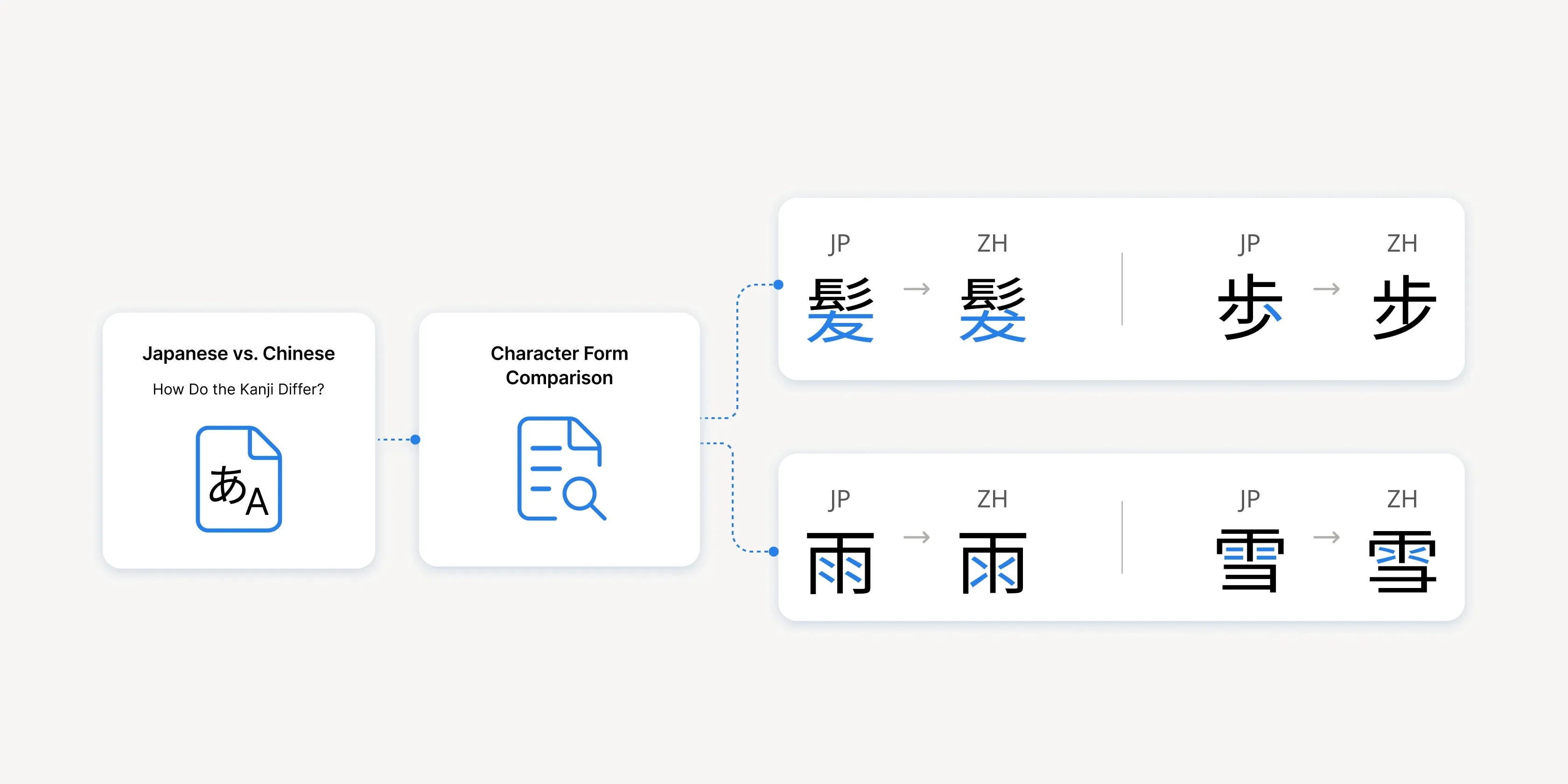
The same kanji set compared in Chinese and Japanese glyph forms, differing in strokes and structure
Japanese kanji and Chinese glyphs look similar but differ in strokes and structure. Incorrect glyphs can make Japanese users immediately feel that the product is not local.

My adjustment: Make glyph checking part of Japan-market design rules

After discovering the issue, I began rechecking font usage across Japan-market products and worked with design and marketing to define Japanese interface typography more strictly: all Japan-market products and external screens should use Japanese-language fonts, and design reviews should confirm that kanji glyphs fit Japanese context.

To me, this was not a visual detail, but a signal of product identity and market credibility. When a Japanese interface contains Chinese glyphs, it does not communicate “we support Japanese”; it communicates “we have not fully understood the cultural standards Japanese users apply when reading text.” This experience made me more rigorous in later Japan-market design: text is not only content; glyph shape itself is part of localization.

Ch.3BrandIP is not decoration, but an entry point for reducing unfamiliarity

Problem: The first challenge for overseas medical SaaS is being approachable

To create products better suited to Japan, the company sent me to Japan for user research. Once there, I found that character-based visuals were not a niche branding technique, but a common communication method. From banks and real estate to medical-related services, brands used characters to reduce distance, make information easier to understand, and increase familiarity and credibility.

For Japanese clinics, a new medical SaaS brand from overseas first has to overcome unfamiliarity. Especially when the product involves AI, website implementation, CRM, or automation, users are not only judging whether the function is useful; they are also judging whether the brand is trustworthy and whether it understands how Japanese clinics communicate.

So in Japan-market website design, we intentionally used more character-based visuals. This was not simply making the product cute or filling the page with decoration. It was to make an unfamiliar overseas medical SaaS easier to remember, understand, and approach on first contact.

My judgment: Approachability should serve trust, not replace professionalism

The risk of character design is that if it becomes too cute, it can make a medical product feel insufficiently formal. My judgment was not to make the brand entirely cute, but to reduce first-glance distance through character visuals while keeping information clear and tone professional.

At the same time, a character cannot be only a one-off illustration. If a character becomes part of brand communication, it needs consistent personality, logic, and usage rules so that it can maintain a coherent image across pages and materials. This is why the company invested in the character’s story world for the Japanese market: not only drawing a cute character, but designing a worldview that can remain consistent across product introduction, website communication, and brand assets.

This direction allowed the website to do three jobs:

  • Reduce unfamiliarity around an overseas brand and AI product through character visuals
  • Turn the character into an extendable brand asset through stable personality and story logic
  • Maintain medical-service credibility through clear information architecture and professional tone

IP design is not about making the product cute. It is about making a high-trust-threshold medical product easier to approach, while character definition allows that approachability to continue consistently.

Character-based visuals used across Japanese public communication, commercial services and medical contexts
In Japan, character visuals are commonly used in public communication, commercial services, and medical-related contexts to make formal or unfamiliar information easier to notice, understand, and approach.

Because most design team members remained in Taiwan, we also tried different ways to enter the Japanese market remotely. Beyond websites and static materials, the design team created short AI videos, allowing characters, product concepts, and brand tone to appear in a more watchable and shareable form. These videos did not replace sales visits or field research; instead, they added a lightweight, sustainable brand touchpoint when the team could not stay in Japan long-term.

This changed how I understand cross-market brand entry: when the team is not local, design cannot rely only on one website or one proposal. The brand needs to be split into multiple touchpoints that can be encountered, shared, and remembered. Short AI videos were one such experiment, helping the Japanese market form impressions of the brand and characters before formal product contact.

Ch.4ChannelsJapan CRM is not one channel, but three different communication problems

Problem: If CRM is understood only as “sending messages,” B2B, B2C, and offline promotion get mixed together

While promoting the Japan business and developing CRM products, I found that “communication channels” could not be understood only through LINE. For us, CRM involved three different layers:

  1. B2C communication from clinics to patients: We provide B2B CRM for clinics, but clinics’ real communication targets are patients. During development, we found that Japanese clinics needed email or SMS in addition to LINE for reminders, follow-up notifications, campaign messages, and educational content. CRM design therefore could not serve only one instant messaging tool; it had to support clinics reaching patients through different channels.
  2. Tracking offline promotion for online booking: When we helped clinics promote online booking, touchpoints were not always online. Clinics might use printed flyers, fax, in-clinic materials, or front-desk assets to guide patients to scan a QR code and enter online booking. The design task was not just placing a QR code, but making offline materials traceable: we needed to know how many people scanned from offline materials to judge whether they were effective.
  3. Helping clinics see product impact: Clinics do not always naturally notice the value brought by CRM or Google online booking. So we also used performance newsletters to show clinics appointment numbers, usage results, and impact from CRM and Google online booking. These newsletters were not simple notifications; they helped clinics understand “this product is creating results for me,” increasing continued use and trust.

My judgment: First clarify the communication target, then decide channel and metric

For Japan-market CRM and sales materials, I first separated the three problems, then decided the design approach:

  • B2C patient communication: Which channels do clinics need to reach patients? What should LINE, email, and SMS each carry?
  • Offline-to-online flow: Is the QR code on printed materials clear? Can scanning behavior be tracked? Can we judge how many bookings or visits offline materials created?
  • B2B impact feedback: Can clinics see how many appointments CRM and Google online booking brought them? Can performance newsletters make product value concrete?
  • Cross-channel consistency: Whether through LINE, email, SMS, printed QR codes, or performance newsletters, the message should tell clinics or patients what to do next.
  • Traceability: Online and offline touchpoints need to return data so the team can know which channels actually work.

This changed how I understand CRM design. It is not about putting all communication into LINE, nor mixing email, SMS, printed QR codes, and newsletters into one concept. It starts by clarifying who is communicating with whom and what each channel needs to accomplish, then designing every touchpoint to be reachable, actionable, and traceable.

In the Japanese market, CRM design includes three things at once: helping clinics reach patients, guiding offline materials back to online booking, and helping clinics see the actual outcomes the product creates.

Japan CRM in three scenarios: LINE, email and SMS to patients; QR codes guiding print back to online booking; performance newsletters
Japan CRM is split into three scenarios: clinics use LINE, email, and SMS to reach patients; offline print materials use QR codes to guide patients back to online booking; performance newsletters show clinics booking outcomes.

Ch.5ResearchField interviews are not just bringing people on site; they are making the site willing to speak honestly

Problem: Once on site, we found our original interview method did not necessarily fit Japanese clinics

When we conducted interviews in Japan, we initially thought bringing all relevant roles on site would make information more complete: leadership, sales, translators, designers, and others visited clinics together.

But once there, we realized clinic rooms were small. Too many people entering the interview space created not only physical pressure, but also made participants answer more conservatively. They were not facing one interviewer, but an entire external team, which changed how they spoke.

Language was another issue. I was used to open-ended contextual inquiry or semi-structured interviews, such as asking clinics to walk through their daily workflow: “What happens first? Who takes over next? When do you need to confirm or go back?” This natural narrative lets participants start from their own work context instead of only answering whether a function is easy to use.

But in cross-language interviews, this became harder. Translation added another layer, breaking the rhythm of follow-up questions. Participants’ tone, pauses, hesitation, and additions could be simplified after interpretation. As a result, we heard organized content rather than the user’s original narrative context. Sometimes we thought we understood, but distortion had already occurred.

My adjustment: Cross-language research needs more observation, follow-up, and concrete scenario calibration

This experience made me realize that cross-market research is not moving the original interview process overseas. It requires redesigning the method based on local conditions.

Later, I paid more attention to:

  • Reducing the number of people entering the consultation room to lower pressure
  • Clarifying roles in advance to avoid multiple people asking questions at once
  • Making interview questions shorter and more concrete to reduce translation loss
  • Breaking open-ended contextual interviews into clearer workflow nodes and follow-up sequences so interpreters can keep pace
  • Leaving time for translators to confirm meaning instead of rushing to the next question
  • Using flow diagrams, screen demos, or concrete scenarios to support communication
  • Observing pauses, hesitation, and mutual confirmation in addition to listening to interpreted answers
The hard part of cross-language interviewing is not that you do not understand. It is that you think you do.

When there is an extra layer of translation, designers need observation, follow-up, and concrete scenarios to calibrate understanding.

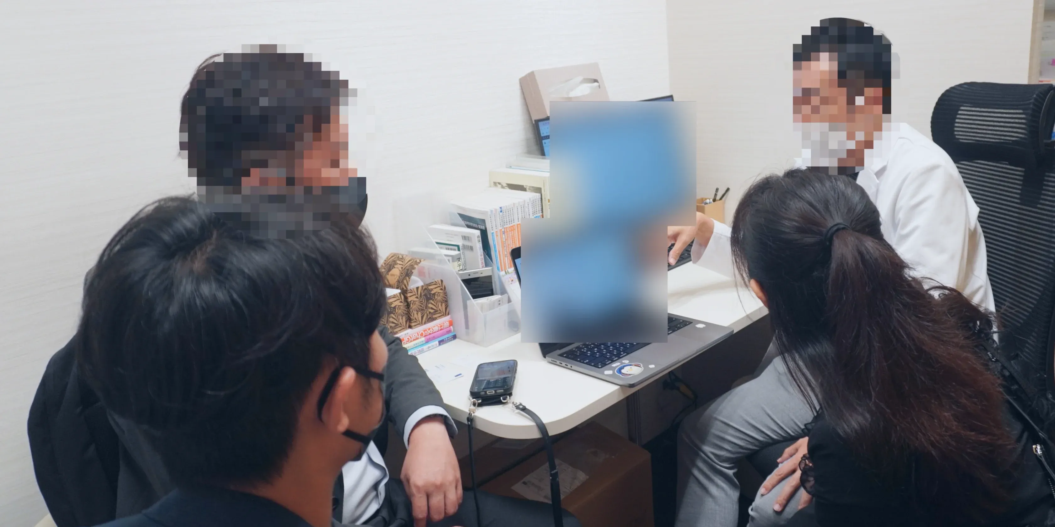
A Japanese clinic interview: limited room, clinic staff, interpreter, sales and design members all present
Japanese clinic interview rooms are limited in space. When clinic staff, interpreters, sales, and design members are all present, research methods must adjust team size, question rhythm, and translation flow.

Ch.6ToolsTurning custom requests into tools so sales can advance AI Widget independently

Problem: The market needs flexibility, but product development resources are limited

Beyond cultural tone and brand communication, the website AI Widget faced a more direct adoption issue: every clinic wanted the widget to feel closer to its own brand.

Clinic Copilot is an AI Q&A widget placed on clinic websites (“Ask AI · available 24/7”) and is currently a key product in the Japanese market. After sales began promoting it, common requests included brand colors, button formats, font sizes, language, and FAQ content.

These requests were not new. Sales often raised different customization needs to move deals forward and improve close rates. But product development had limited time and people; the team could not put every market request into the formal roadmap. If every adjustment depended on engineering scheduling or designer-by-designer support, sales would be blocked by waiting, and the design team would be consumed by many low-difference changes.

As designers gradually became more involved in development, I began handling these requests in a lighter way: not turning every custom request into a new feature, but judging which adjustments could be parameterized and tooled so sales could operate them within a controlled range. Across different product initiatives, I built multiple editors that turned repeated customization needs into operable, previewable, deliverable internal tools.

For the Japan-market AI Widget, this judgment became clear: once brand color, button style, font size, and demo scenarios repeatedly appeared, the problem was no longer “can design make it faster,” but “should this flexibility become a self-service tool for sales?”

My decision: Do not take on more customization; make customization a controlled self-service tool

I proposed the direction: build a style editor so sales can adjust, preview, and deliver by themselves. I designed the full UI and also participated in turning it into a usable tool.

The editor lets sales adjust brand color, gradient, glassmorphism effect, card border, launch button format, font size, and multilingual quick replies with live preview. The design focus was not offering many options, but organizing the parameters sales actually needed in proposal situations into an understandable, previewable, deliverable flow.

I also added a readability check. The system calculates contrast between white text and the primary color in real time and indicates whether it meets WCAG AA. If the user selects a color that is too bright, the system automatically darkens it to keep white text readable.

Sales get brand flexibility, but do not have to carry usability judgment; the system protects usability.

Delivery: Make the demo happen on the customer’s own website

After style adjustments are completed, the editor can output a bookmarklet, embed snippet, and standalone URL.

The bookmarklet was a delivery method I specifically designed for sales demos. Sales can open a prospect’s own website during a proposal, click the bookmark, and load the Clinic Copilot Widget with the adjusted brand color onto that website.

This lets sales show not only a slide deck, but let clinics directly see: “This is what the AI Q&A tool would look like on our website.”

The style editor is therefore not only a customization tool. It turns design capability into a sales tool usable in the field, while preventing design and development resources from being consumed by repeated customization so they can focus on more core product problems.

The AI Widget style editor: brand colour, button style, font size and readability check in one interface
The AI Widget style editor centralizes brand color, button style, font size, and readability checks, allowing Japan sales to adjust, preview, and deliver independently.

OutcomeFrom cultural observations to design rules

These experiences were eventually organized into product and design rules the team could reuse:

  • AI Agent tone: Separate emoji into an independent toggle and provide different reply styles so clinics can control AI tone according to Taiwan / Japan cultural differences, brand personality, and medical context.
  • Japanese typography guidelines: Use Japanese-language fonts for Japan-market products and verify kanji strokes and glyph shapes to avoid the product being recognized as foreign at a glance.
  • Website characters and AI short videos: Use character visuals and online content to reduce unfamiliarity around overseas medical SaaS and AI products, while increasing brand exposure when the team enters Japan remotely.
  • CRM communication materials: Split Japan-market CRM communication into three design problems: LINE / email / SMS notifications from clinics to patients, QR-code tracking from offline print materials to online booking, and newsletters that show clinics appointment outcomes.
  • Field interview methods: Adjust interview team size, question format, and communication aids based on Japanese clinic space and cross-language communication limits.
  • AI Widget style editor: Turn repeated sales customization needs into tools, allowing Japan sales to demo and adjust independently in proposals while keeping design and development resources focused on core product issues.

Reflection

This case changed how I understand localization. It is not translating an existing product into another language. It is rechecking which assumptions inside the product only work in the original market.

In Japanese healthcare, professionalism does not necessarily mean coldness, and friendliness does not necessarily mean cuteness. An emoji, a kanji stroke, a performance newsletter that shows clinics booking outcomes, a printed QR code that can track offline scans, or one extra person in an interview can all affect whether users believe this product understands how they work and whether they are willing to let it represent the clinic in patient interactions.

What I learned is that cross-market design should not begin by assuming we already know the answer and then moving the product over. It should begin by understanding how the local market builds trust, receives information, and judges professionalism, then translating those observations into product rules, communication materials, and design methods the team can reuse.

Good localization design does not only make a product look local. It helps the team know which cultural standards cannot be ignored in the next decision.

All internal materials are anonymized and shown from demo environments; no patient or client data is disclosed.