Case 04 · Design System × Storybook
One source of truth — for designers, engineers, and the AI that codes with us
Getting Figma, Storybook, product, and AI to speak the same language
In this project, I served as PO and drove the organization and implementation of the 1.Talk design system. The goal was to make Figma, Storybook, the production product, and the AI that helps us code all use the same component rules. I also enabled designers to directly participate in maintaining the component library, instead of only handing requirements to engineers. The component library currently has around 40 components, serving 11 daily users across design and frontend, and has shortened the design delivery process from 5 days to 2 days.
Outcomes
- Shortened the design delivery process from 5 days to 2 days: wireframes, UI mockups, and frontend rebuilding are no longer necessary steps, reducing meetings and back-and-forth confirmation
- Built around 40 components, serving 11 daily users across design and frontend
- Established a two-layer UI review: Chromatic first checks components themselves, then Preview Links verify screens after components are placed back into the product
- Semi-automated release process: after a PR is merged, AI suggests version number and release type; once confirmed, CI release is triggered, and the product can update to the new version
- Role
- PO — defined component governance rules and migration strategy, drove design / frontend collaboration, and set up two-layer UI review: Chromatic for visual comparison in the component library, Preview Links for checking results after product integration
- Team
- Designer ×1, frontend engineer ×1 — anonymized by role
- Method
- Single source of truth + progressive migration. Validate “visual consistency” and “unchanged behavior” separately; invisible change for users is the acceptance standard.
1ContextAI made output faster and forced us to re-examine which steps could be removed
When output gets faster, repeated work from the old process becomes more visible
AI changed how design work begins. In the past, designers usually created wireframes, then UI mockups, then handed them to frontend engineers for reimplementation. Now, AI can help designers create prototypes directly in code that is close to the production product, making us ask: are all these middle steps still necessary?
AI did not create new rework. It made us see more clearly how much manual translation had always existed between design and engineering. As prototypes become closer to implementation, the team naturally starts asking: which tasks only exist to bridge the gap between design and engineering? Which can be removed?
But to make that happen, designers, engineers, product, and AI must all look at the same component source. Otherwise, no matter how fast AI generates screens, the team may still need to reorganize Figma, re-check component specs, and decide whether to use new or old components.
For 1.Talk, this problem was especially visible. The new component library and Storybook were already built, but many pages in the production product still used old components. As a result, Figma, Storybook, the product, and AI were seeing different versions:
- Designers changed styles, but the product did not necessarily sync.
- Engineers did not know whether to use new components or old ones.
- AI-generated interfaces might reference components that were about to be deprecated.
So this project was not really about “building another design system.” It was about finding a bridge that could align design, engineering, product, and AI.

The problem was not lack of tools, but lack of shared judgment
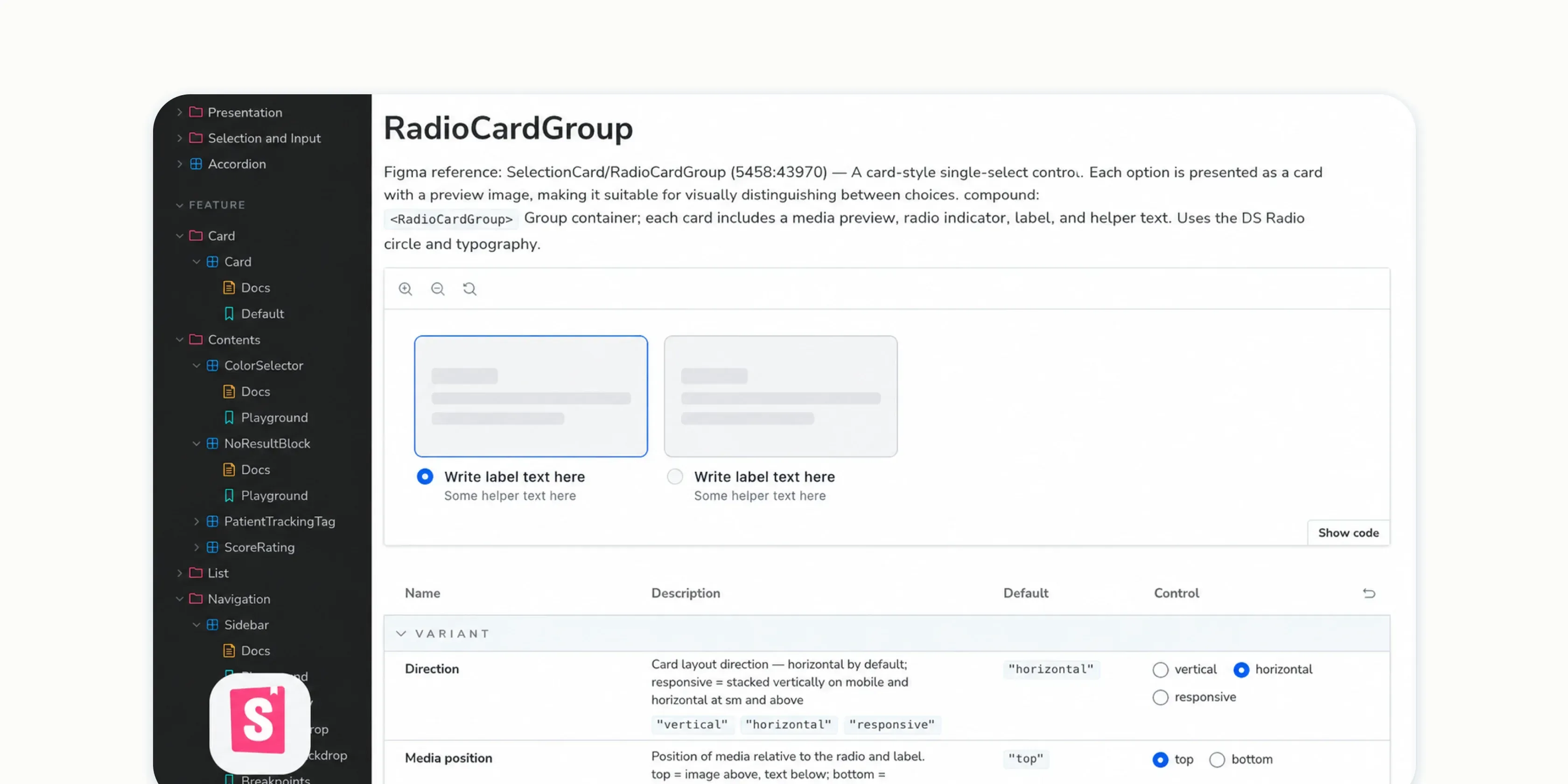
Later, we found that Storybook was well suited to become this shared reference point. It was not only a place for engineers to view components, but also a place where designers could confirm component states, engineers could inspect implementation, and AI could generate interfaces based on the same rules. Only when everyone judges through the same source can a design system truly enter daily delivery.
2InsightWhat needed organizing was the shared language between design and engineering
The key to this project was not adding another document, but creating a component language that designers, engineers, and AI could all execute.
As prototypes become closer to production, delivery methods that rely on manual confirmation become bottlenecks. What really needed organizing was a shared set of rules that lets each role judge: which component should be used now, which states are correct, and when it is safe to replace an old component.
This also made me realize that the essence of the project was not adding features, but slowly replacing the product foundation while users almost do not notice. Building a new system is not hard; safely retiring the old one is.
3Design challengeReplace the underlying components without users noticing
The hardest part of the migration was not making new components, but gradually replacing the product’s underlying components without affecting daily use.
- Frequently used pages could not break: Appointment, member, and AI Agent features are used every day, so screens could not shift or interactions suddenly fail because components were replaced.
- Existing user habits could not be interrupted: Components could be updated, but button positions, flow structure, and familiar operating rhythm needed to remain as stable as possible.
- The team could not get lost during migration: While new and old components coexisted, designers, engineers, and AI all needed to know which component set to use to avoid creating new confusion while cleaning up the old one.

4StrategyAlign rules first, then replace step by step
Because this problem could not be solved by replacing one component, I broke the approach into three parts:
- Let everyone look at the same components first: Use Storybook as the shared reference so designers, engineers, product, and AI all know which component rules to follow.
- Check components and product screens separately: First confirm the component itself looks right; then check it again after it is placed back into the product page.
- Track progress with lists and gradually replace old components: Everyone needs to see which pages have been updated, which components remain, and which version has been released.

5Solution 1Make Storybook the shared language for design, engineering, and AI
The first step was turning Storybook from “component documentation for engineers” into a shared reference for everyone.
Designers can use it to confirm component states and variants. Engineers can inspect implementation. AI can generate interfaces according to these rules. When everyone looks at the same place, the design system is no longer just documentation; it becomes part of daily delivery.
What made this different from a typical design-system cleanup was that we were not only organizing component specs for designers and engineers. We were also organizing a set of rules that AI could follow.
Even further, designers no longer only filed requests. With AI support, they could directly participate in maintaining the component library: development, checking whether code works, code review, and opening PRs could all be led by designers. Engineers mainly supported environment setup and release.
So these specifications were not just documents; they directly shaped production output. For example, colors must come from tokens, hardcoded color values are not allowed, and every component needs a showcase page. The clearer the rules, the less likely AI is to make mistakes while assisting development.

6Solution 2Validate “visual consistency” and “unchanged behavior” separately
The risk of replacing components is not only whether the new component looks right, but also whether the original product experience is affected once the component is placed back into the product.
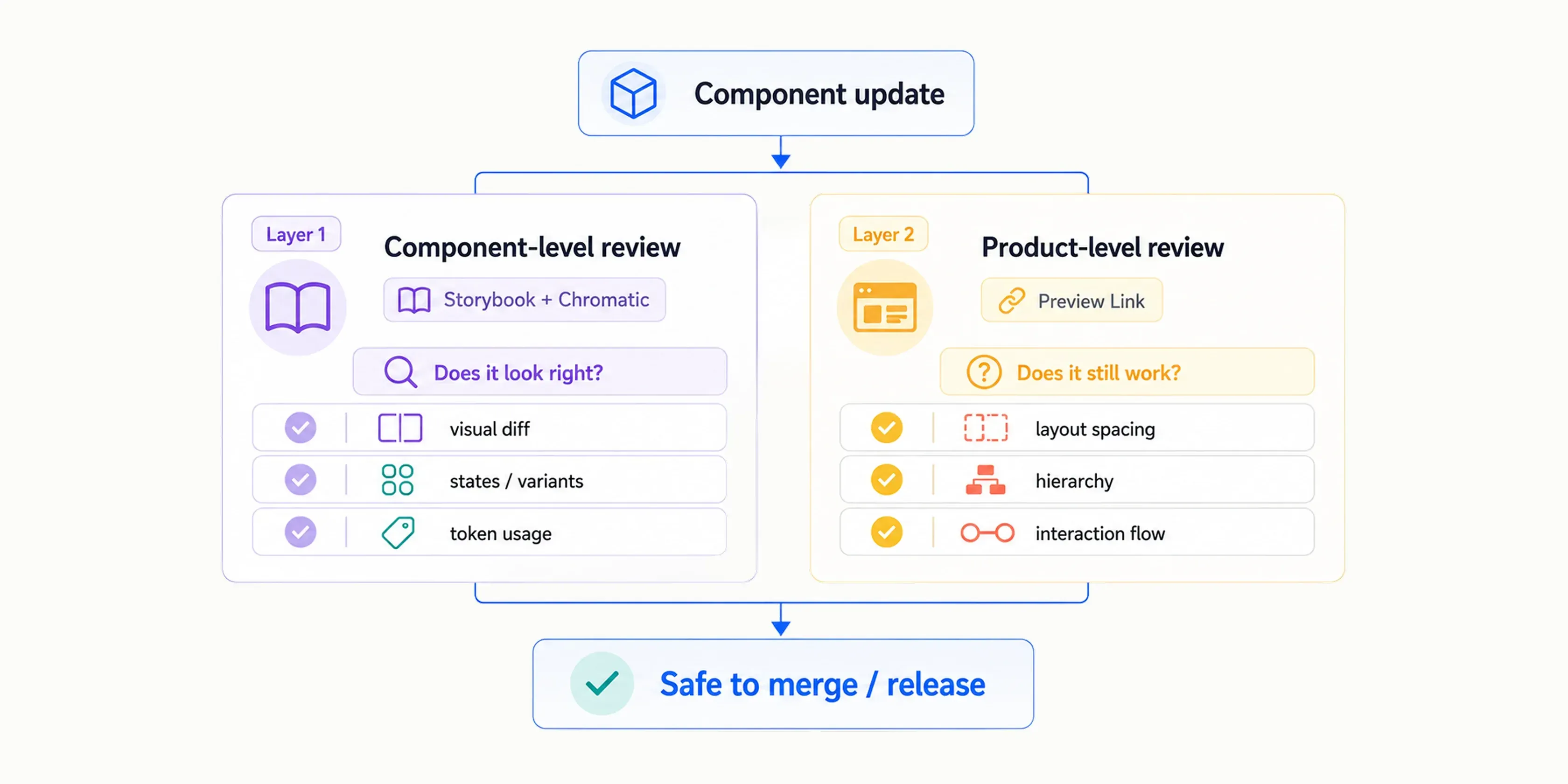
So we split review into two layers:
- Check the component itself first: Use Chromatic in Storybook to compare components such as Button, Input, and Modal, confirming that the new component looks as expected.
- Then check the product screen: Use Preview Links to return to the actual product page and verify that spacing, color hierarchy, and interaction flows are not affected.
This allowed us to judge two things separately: whether the component was changed correctly, and whether the product remained stable in use.

7Solution 3Make migration progress visible
Old components were scattered across many product pages and could not be replaced all at once. Without a tracking list, it would be easy for someone to update one part while others had no idea where things stood.
So we split migration tracking into three types:
- Page list: Mark each page as completed, in progress, or not started.
- Component tasks: After each design-system release, create tasks based on the components changed in that version so frontend can gradually replace old Buttons, Inputs, Modals, and other components in the product.
- Independent release: The design system releases independently, without requiring the product to update immediately. AI suggests the version type first; a person confirms before release. The product updates to the new version when ready.
This let everyone understand where the migration stood and break a large replacement into safer small steps.
The list was not only a progress tracker; it became the decision basis while old and new components coexisted. Designers could know which pages were ready for new components, engineers could replace components based on tasks, and the product side could confirm which version was currently adopted, avoiding repeated judgments of the same component across pages.
8It changed the entire delivery process
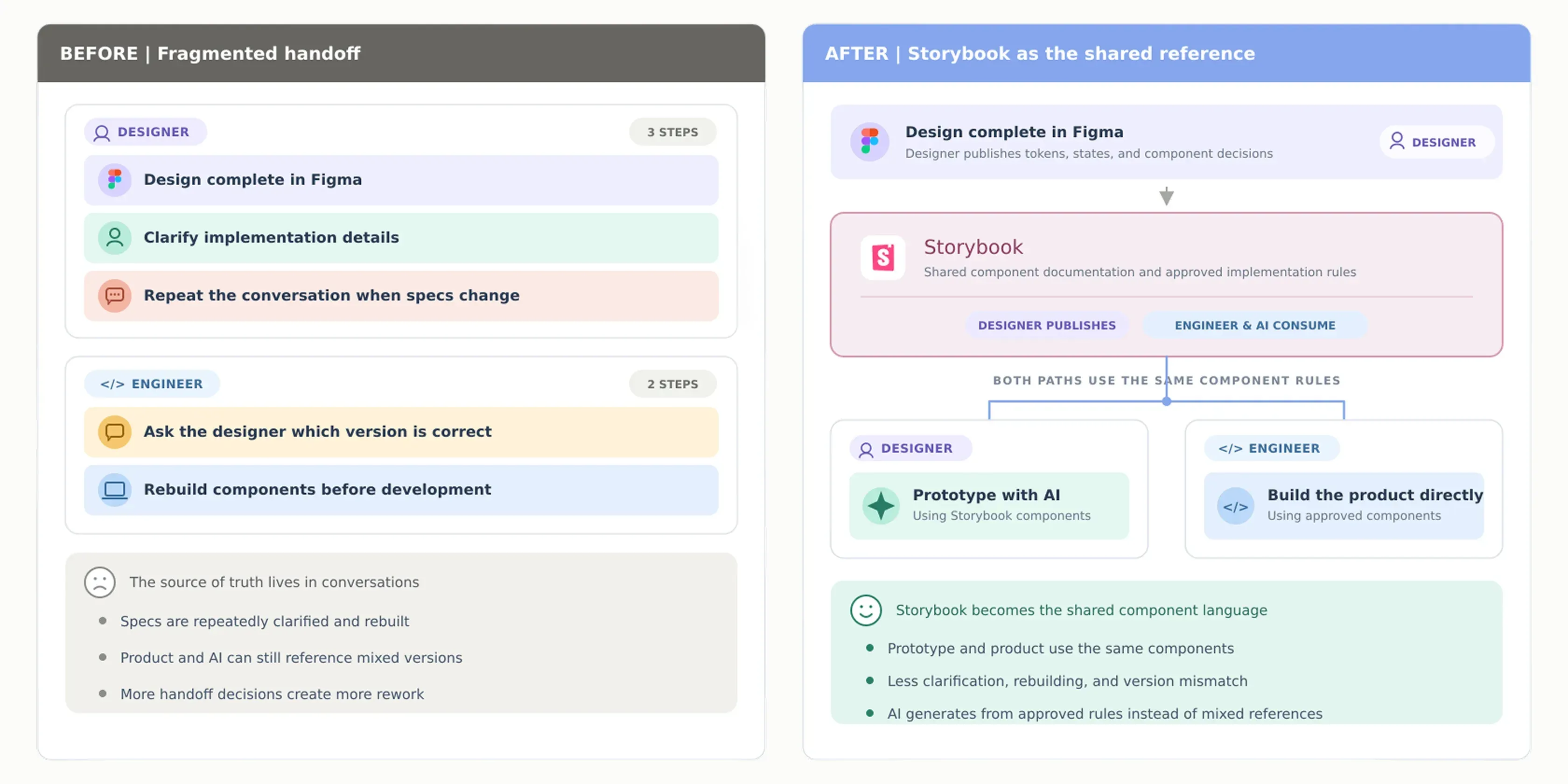
The biggest change from this project was not only faster design. It made some previously assumed steps no longer necessary.
In the past, designers usually created wireframes, then UI mockups, then prototypes. After receiving the design files, frontend engineers rebuilt the screen. Each stage required meetings and confirmation, and misunderstanding could easily create back-and-forth revisions. A complete delivery cycle usually took around 5 days.
Once Storybook became the shared reference between design and engineering, designers could directly build prototypes with components close to the production product. Frontend no longer needed to reinterpret the screen or rebuild the UI, but could work from the same component foundation and connect APIs and product logic. Delivery time shortened to 2 days.
What we saved was not only time, but repeated work:
- Wireframes
- UI mockups
- Frontend rebuilding
This process now supports around 40 components and 11 daily users across design and frontend. It also answered the project’s original question: AI helps designers prototype faster, and Storybook prevents the prototype and production product from needing to be rebuilt separately.

9Outcome
This project ultimately produced more than a new component library. It brought the design system into daily delivery.
Previously, Figma, Storybook, product, and AI each looked at different sources, so design and engineering relied on manual confirmation to maintain consistency. Through this migration, we consolidated component rules into Storybook, allowing designers, engineers, and AI to work from the same rules.
For the team, the design system is no longer only documentation for “maintaining visual consistency.” It became a working method that supports prototyping, development, review, and release.
10Reflection
This project changed how I understand the value of a design system. It is not about organizing prettier components, but about enabling the team to deliver products using the same rules.
I used to think the focus of a design system was “building.” After actually driving this project, I realized the harder part is “converging”: safely retiring old components and making sure designers, engineers, and AI all know which rules to follow. As long as people are looking at different sources, the design system may exist but still fail to be used.
It also changed how I think about specifications. When AI becomes part of the delivery process, specs cannot rely only on human tacit understanding. They need to be executable: colors must come from tokens, component states must be complete, and every change must be checkable. The clearer the rules, the more reliably humans and AI can collaborate.
I also realized that AI’s value is not only helping us finish existing work faster. It helps us re-examine which tasks are merely middle steps left behind by old workflows. Once those steps are removed, a design system cannot remain just documentation; it must become a working foundation shared by design, engineering, and AI.
Finally, I learned that good governance does not remove all friction. It preserves the moments that require human judgment. For example, “merge does not equal release” is a deliberately kept safety point: things that can be automatically checked go to the system; irreversible release decisions stay with people. This makes the design system not only a set of components, but a way of supporting safe team delivery.
Next, I hope the design system can carry more design judgment, such as spacing rhythm, accessibility rules, and content tone — not only explaining what the UI looks like, but also preserving why it is designed that way.